Master style sheet. Everything Imperium ships starts here: brand-v5 tokens, Emilio and Switzer type, greens only, radius 2, pointed (re-locked 2026-08-22), one Ember accent per view maximum. Sections below are live specimens, not screenshots; the cards and components are the working HTML files, embedded. Every file on this page is downloadable at the bottom, or grab the whole kit as one zip. Canonical hosted copy: brand.imperiumos.ai (works for humans and for AI sessions: point any agent here and it can read the page and pull the zip headlessly).
What Imperium is
The company
An AI consultancy and AI software company. Imperium builds and runs AI operating systems for SMEs, Palantir-style: build it AND run it. The fastest explainer, for anyone who knows Palantir: the Palantir for SMEs. Serious data-and-AI decision systems for companies of £3-50M revenue and 20-250 staff, in any operations-heavy industry. Real estate is the leading wedge, not the boundary.
The thesis
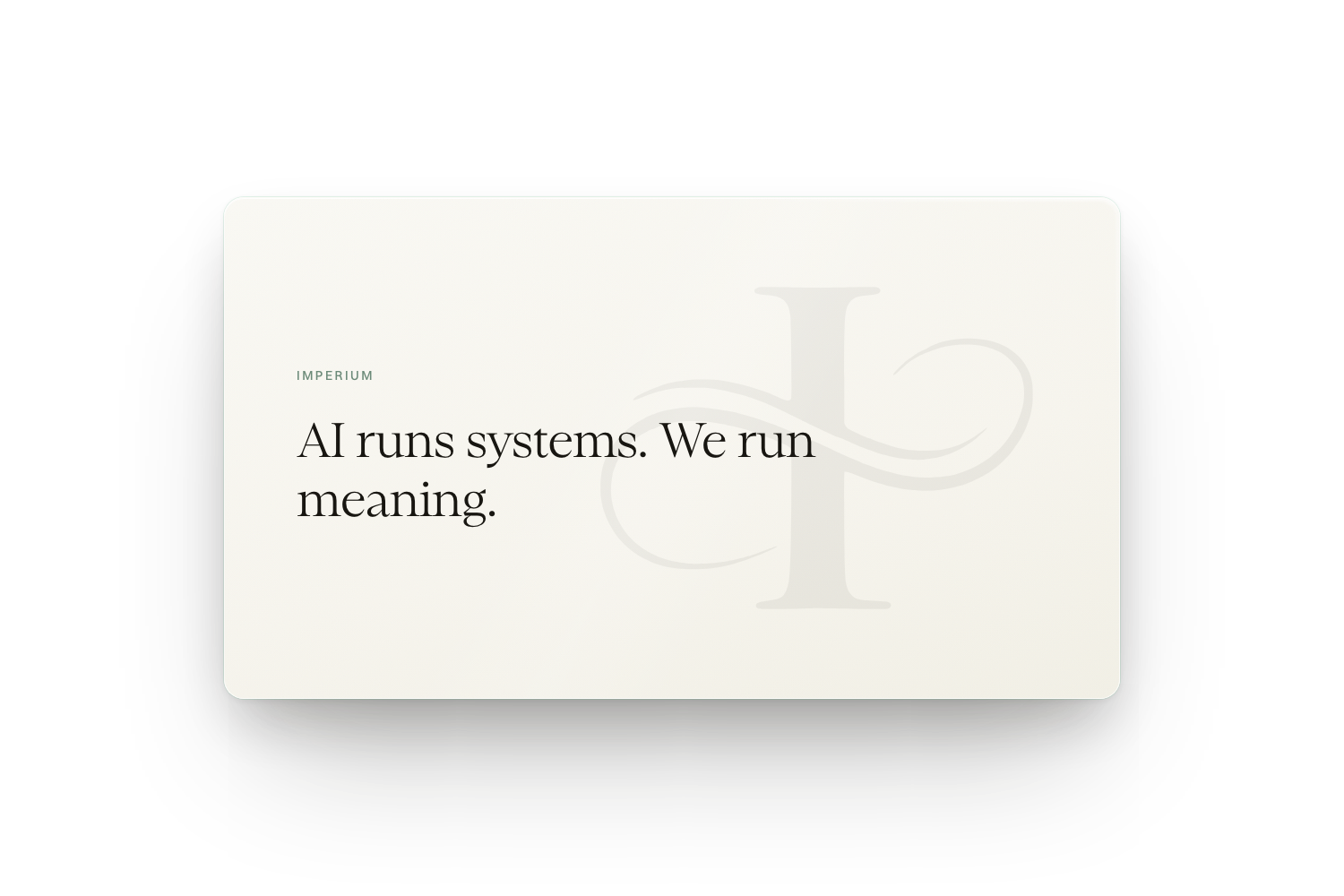
AI runs systems, we run meaning. Imperium is not an agency and never bills hours. It owns outcomes and the systems that produce them. Grown-up, timeless, quiet confidence. Never "enterprise", never "AI agency", never "Imperium Growth".
The intersection (the brand soul)
Classical (authority, history, form and function, things built to last) meets modern (AI, glass towers, the newest technology adopted early). The tension between the two IS the brand. Old paintings beside clean glass. A serif carved from tradition beside a precise modern sans. Heritage racing green beside a live dark console. Every asset carries a little of each, never only one.
If Imperium was a...
Building: a glass atrium set into a classical colonnade (the Architecture card). Car: a racing-green heritage GT with modern engineering under the shell (the Racing card). Book: a first edition kept in working condition, read daily, not displayed (the Knowledge card). Room: the operator's console overlooking the old city (the consoles below). The four theme cards in this sheet are these metaphors, rendered.
Logos (rebuilt as vectors, Racing Green #11462C, R2 tiles)
The mark is the Imperium monogram: a serif I crossed by an infinity swash. Classical letterform, one continuous modern line. Rebuilt 2026-07-27 as true vectors: one traced master path plus real Emilio Light outlines for the wordmark, coloured only with brand tokens. The old logo set (blue-teal #056050, iOS squircle corners) is retired and deleted; if an asset still shows that green, replace it from here. Tiles use the brand R2, nothing else. Every variant ships as an SVG master plus transparent PNGs (full size + 256px) in the zip under logos/; click any label link to download the file.
This section is a MIRROR of tokens.json / imperium-tokens.css — do not edit values here; edit the token files and re-render. Every duplicated colour/type/radius table in the kit follows the same rule: tokens win.
Racing Green PRIMARY
#D3E0D9100
#5E8C74300
#2E6A4C400
#1B5637600
#11462C700 ★
#0C3220800
#071C12900
Mint
#D8EBDD100
#4CB782300
#35A06D400
#227A50600
#1B6342700
#124630800
#0A2A1D900
Bali (jade)
#D6EEE8100
#52B49C300
#3FA085400
#2C7C67600
#226352700
#174539800
#0D2822900
Neutral spine
#F7F6F1Paper
#EDF2E8Sage
#F4F1EABone
#15130EInk
#0A1F14Deep
#0C1712Console
#17281FOverlay
Ember ALERTS ONLY
#FBDAD3100
#EE7A64300
#E23A28500 ★
#FF4632bright
#C22C1D600
#971F14700
Rules: greens plus the neutral spine plus one Ember element per view, on the one thing that needs attention. No pure white fills (use Paper or Bone). No blue-teal, no warm browns, no decorative gradients on product UI. When in doubt: #11462C.
Type (self-hosted woff2 in ./fonts, per-weight presets)
Emilio Thin
Where authority meets the newest technology
Emilio ExtraLight
Where authority meets the newest technology
Emilio Light · PRIMARY
Where authority meets the newest technology
Emilio Regular
Where authority meets the newest technology
Emilio SemiBold · emphasis
Where authority meets the newest technology
Emilio Bold
Where authority meets the newest technology
Emilio Black
Where authority meets the newest technology
Switzer Regular · body
The system sees every deal, call and number as it happens. AI runs systems, we run meaning.
Switzer Medium · UI
The system sees every deal, call and number as it happens.
Switzer Semibold · numbers
AED 32,000 · 92% · $3,280
Eyebrow style
Operating systems for SMEs
Display = Emilio (Light is primary; call the weight preset, never synthetic bold). Body and UI = Switzer. Wordmark = IMPERIUM in Emilio, tracked caps 0.14em. Console surfaces (dashboards) use Switzer only.
Display weight test (same heading, every Emilio, card context)
The hero heading on the racing ground, set in each Emilio preset. Light stays the primary; SemiBold is the emphasis ceiling for anything customer-facing. Bold and Black exist for rare poster moments, never body-adjacent.
Command your operations
Emilio Thin
Command your operations
Emilio ExtraLight
Command your operations
Emilio Light ★ primary
Command your operations
Emilio Regular
Command your operations
Emilio SemiBold
Command your operations
Emilio Bold
Command your operations
Emilio Black
Shape and radius (re-locked 2026-08-22: pointed)
2px · inputs, chips, small buttons
2px · cards, media, panels of every size (THE standard)
2px · tags and CTAs (pills retired)
Pointed 2px lock by Alex 2026-08-22 (sharper even than VS Code, whose controls sit at 2-4px); supersedes the 20/40 A/B era. Strokes: 1px ink at 10-22% on light, bone at 5-10% on dark. Shadows: soft warm-tinted on light, deep layered on console (tight contact + long ambient). Motion: springs with slight overshoot, 150ms feedback, 600-1200ms brand moments.
Card construction (the anatomy every card follows)
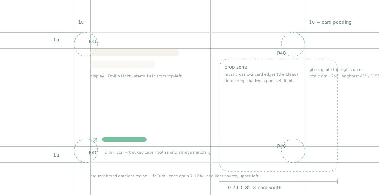
One blueprint, every card: R2 corners, a 1u padding unit, display type top-left, mint CTA bottom-left, porcelain prop at 70-85% card width bleeding off 1-2 edges, glass glint on the top-right, conic rim, grain over the gradient ground. Downloadable as card-anatomy.svg.
Gradient recipes (proven on shipped cards)
RACING DIAGONAL: 148deg #071C12 → #1F5C3C + soft mint radial right. The default hero field (rook, chess, bust cards).
NEAR-BLACK EDGE GLOW: #05100A ground, strong mint radial on one edge. The intense dark mood (laurel, key).
LIGHT SAGE: Paper → Sage 165deg + mint corner. Light mode, Ink text (compass, scales, clock article).
LIT FROM BELOW: vertical, #1F5C3C at the bottom edge + under-glow radial (hourglass).
CONSOLE GROUND (the north star): 168deg #0F1912 → #0A130E → #07100A → #060D08 + top-left beam wash. The ground of the console components (gauge, revenue flow) and every dark component card descends from it: near-black base, glow concentrated at the focal element, never an overall wash.
On top of any of these: SVG feTurbulence grain at 7-12% overlay, small tight corner radials (never big soft ones), 1px bone rim insets, and for premium components the full light treatment (lobes + shafts + smoke + spills) from the imperium-ui-replicate skill.
Hero cards (live files, card-studio skill)
Racing diagonal, single rook
Two objects, edge bleed
Columns + mint holographic ring
Intense dark + edge glow
Light mode, glassmorphic prop
Mixed materials: marble + chrome
Lit from below, severe architectural hourglass
Theme cards (four Imperium themes, dark and light)
Architecture, dark
Architecture, light
Racing heritage, dark
Racing heritage, light
Knowledge, dark
Knowledge, light
Context, dark
Context, light
Ethos cards (six ratios, six grounds, glass corner glints)
Each card pairs one Imperium theme with one porcelain prop (locked style block, card-studio). Corner light-catch arcs + sparks carry the console-component glass language onto flat cards. Mint LEARN MORE rows inherited from the retired category set.
Vivid mint, portrait · See Further
Light sage, square · We Run Meaning
Near-black edge glow, tall · Access, Earned
Emerald dusk (new recipe) · Written to Last
Racing diagonal, wide · Systems That Never Sleep
Muted sage-green, landscape · Signal Over Noise
Article cards
Dark article layout, mask-faded prop
Light article layout, mint button
Interactive console components (live, hover them)
Savings gauge + revenue flow: odometer cash-rolls (900ms, 55ms digit stagger), sprung gauge sweep, glide pools, glass streaks, one top-left light source. Built with the imperium-ui-replicate skill.
Glass folder (v33 lineage): translucent sheet stack, through-glass rim light, slot shadow. Built with the glass-icon-studio method.
Premium reference components replicated pixel-first in the components-lab, then transferred to brand-v5. Every one is a working HTML file with a transparent page (it sits on whatever ground the host page has), a designed light theme (?theme=light), brand type, R2 chrome, and the standard motion language. Ready to lift into a site or dashboard as-is.
Glass bento: what Imperium runs, as glass tiles: live console hero, agents, document intelligence, rolling counters, 150ms hover lifts.
Integrations card: beam-lit stacked cards, through-light relight, hover lift. The "plugs into your stack" story.
Legal docs: generated-paperwork illustration card, porcelain docs with signature flaps.
App dock: the Imperium OS surface as a glass dock: spring hover lifts, click-to-activate indicator, mint glow pool.
Budget chart: monthly operating savings, live: rolling odometer total, spring-staggered column rise, hover any month for the exact figure and delta.
Feature trio: accurate 96% console dial, peaked letter envelope, Imperium-to-software hub. Post cards, dual theme.
Inbox funnel: document cloud pulled through the funnel into one sealed record. Post asset, static by design.
Glow card · logo coin over the tile grid.
Glow card · run your whole operation on one AI system.
Glow card · Consulting x Software, one partner for both.
Glow card · the Imperium Console X-flare.
Launch cover (4:5): engraved slab, carousel opener for LinkedIn banner / carousel / IG post format.
Integrations catalog: the client's real stack as physical tiles, Imperium mark at the centre. Real current app marks, floor reflections.
Software mockups (Imperium OS interface renders, mockup-studio skill)
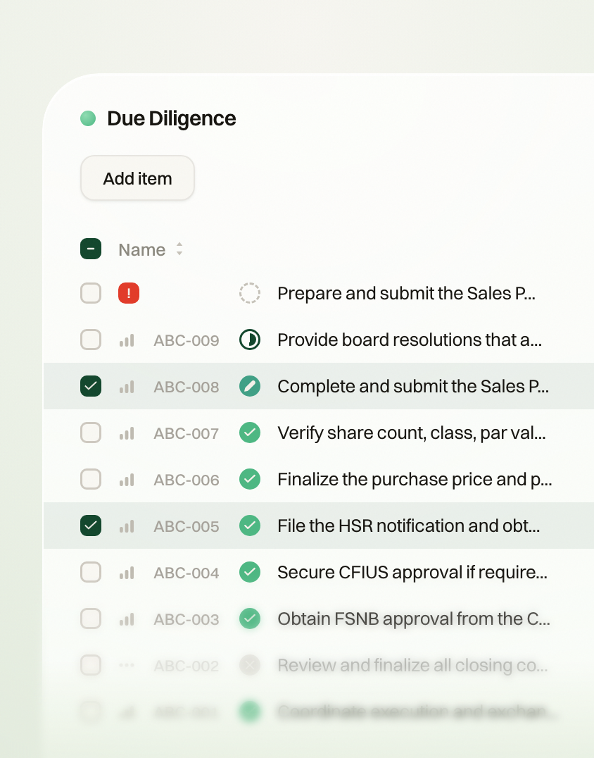
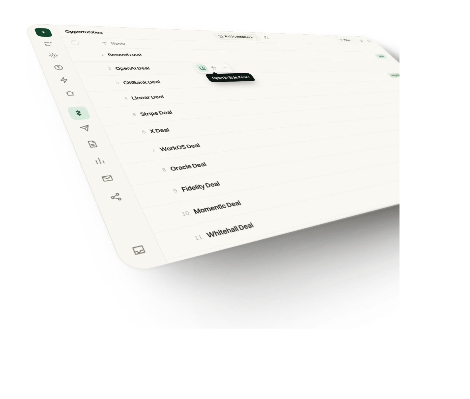
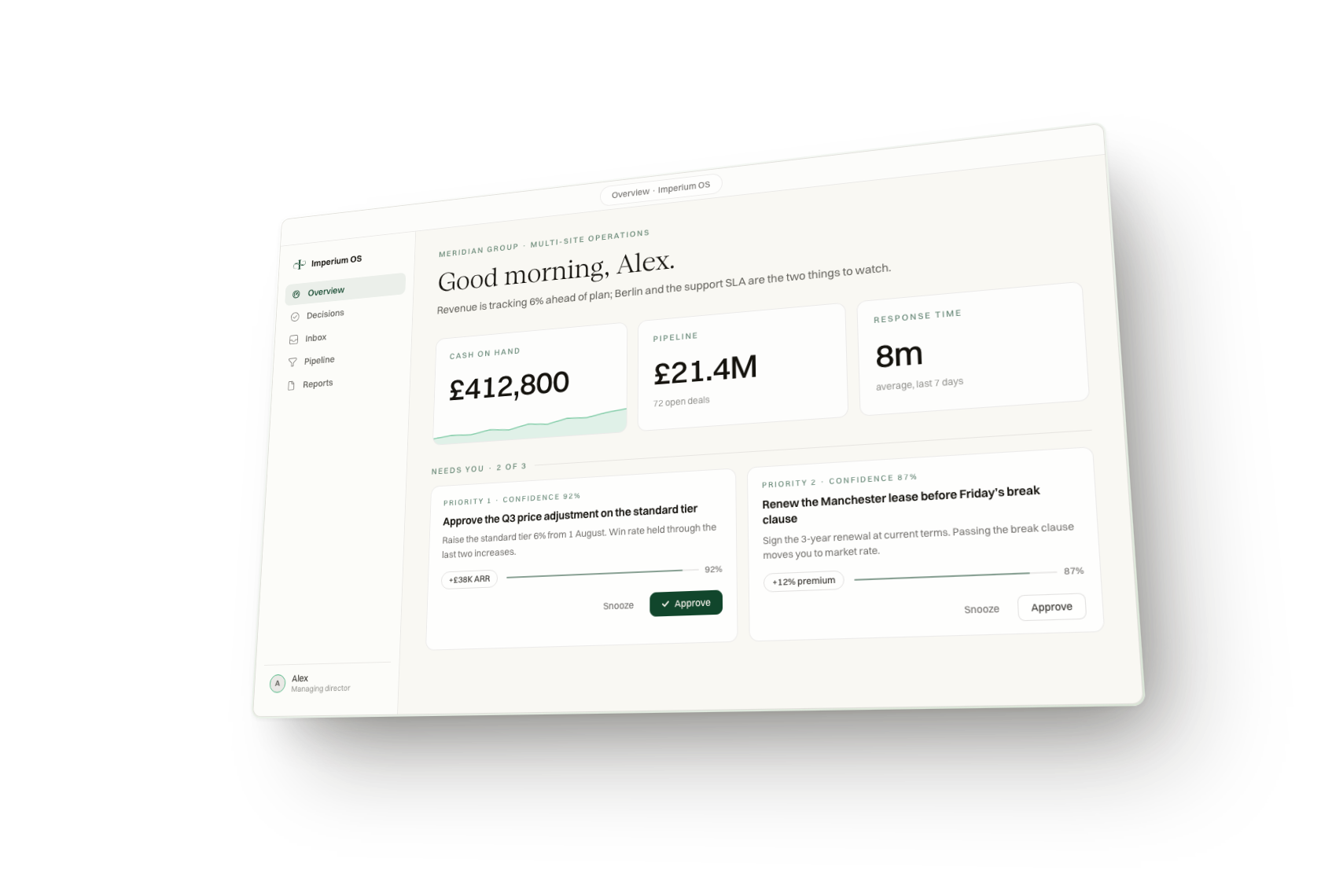
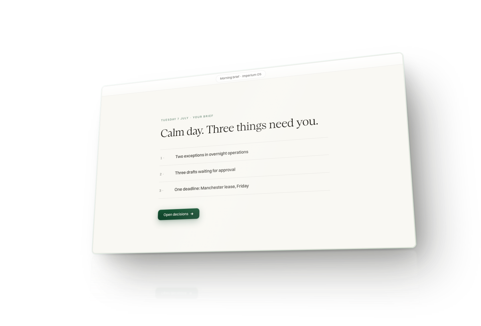
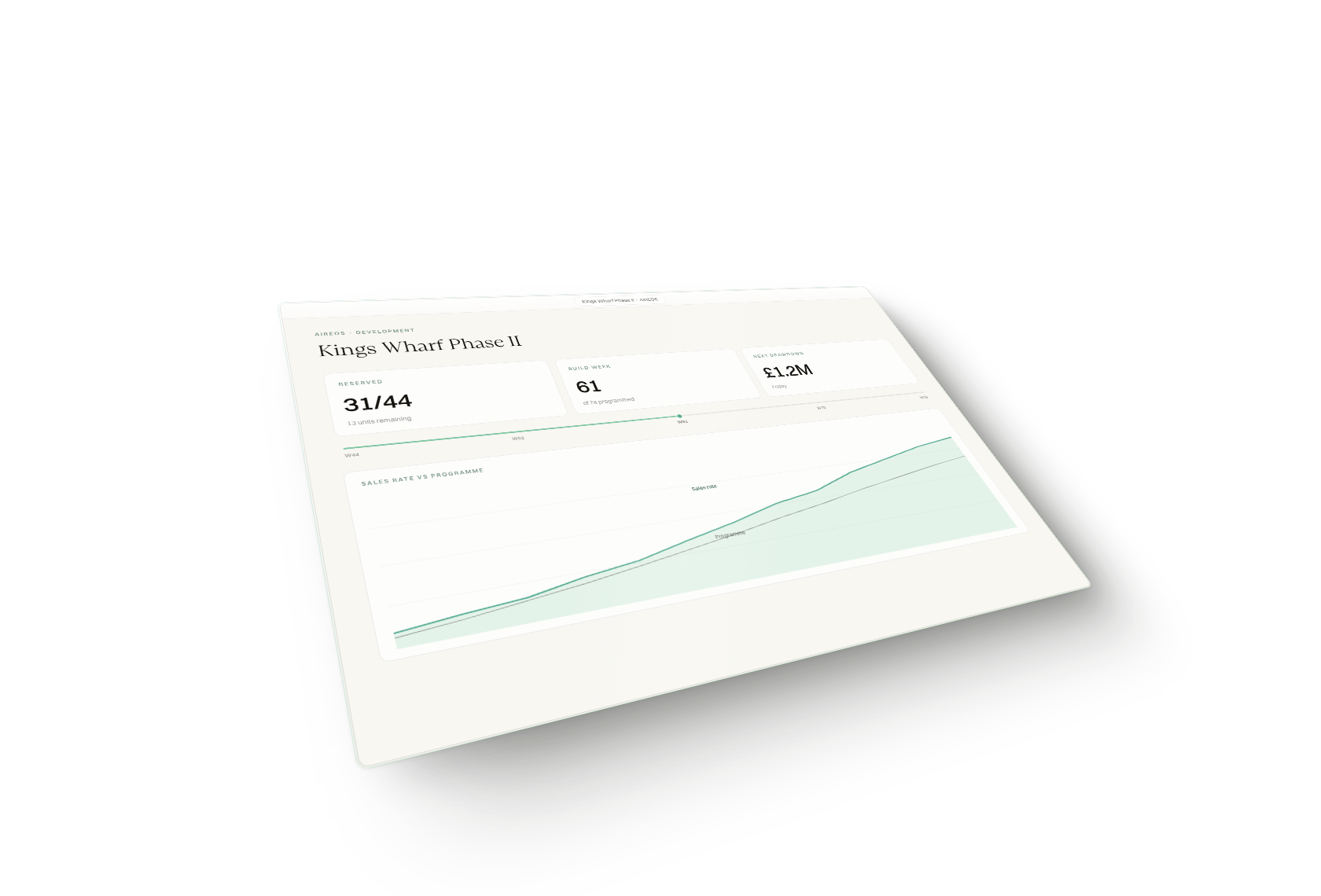
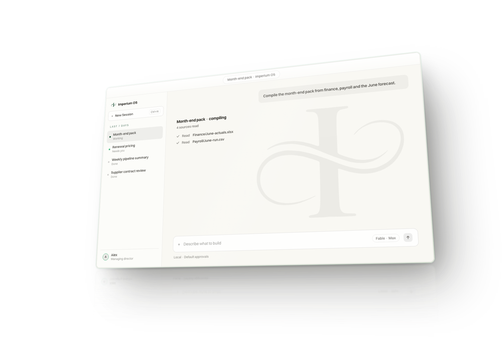
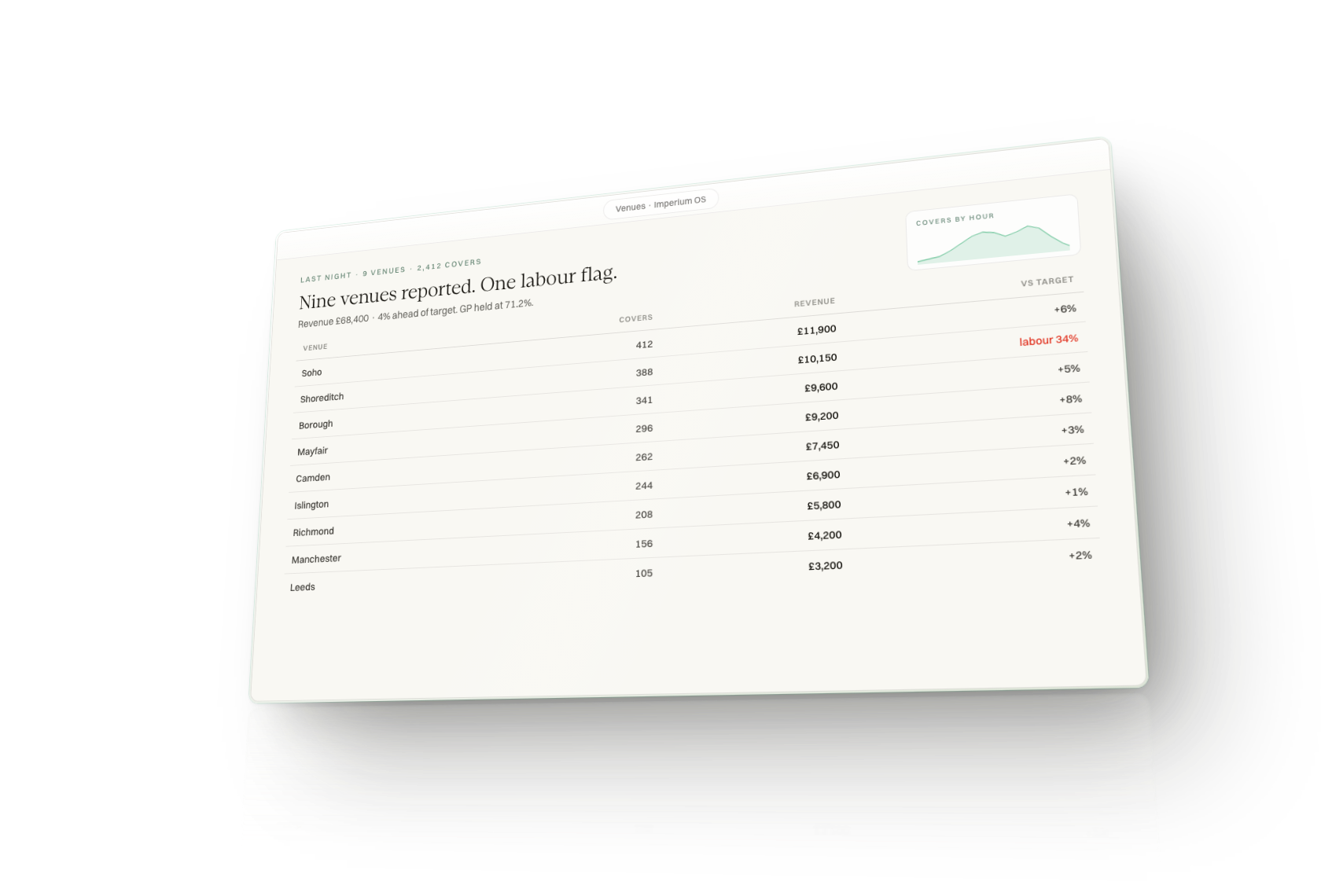
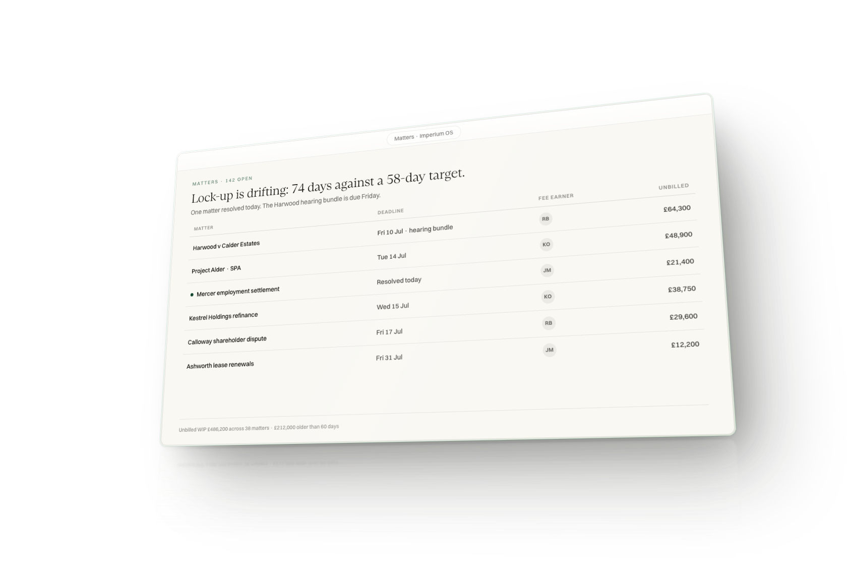
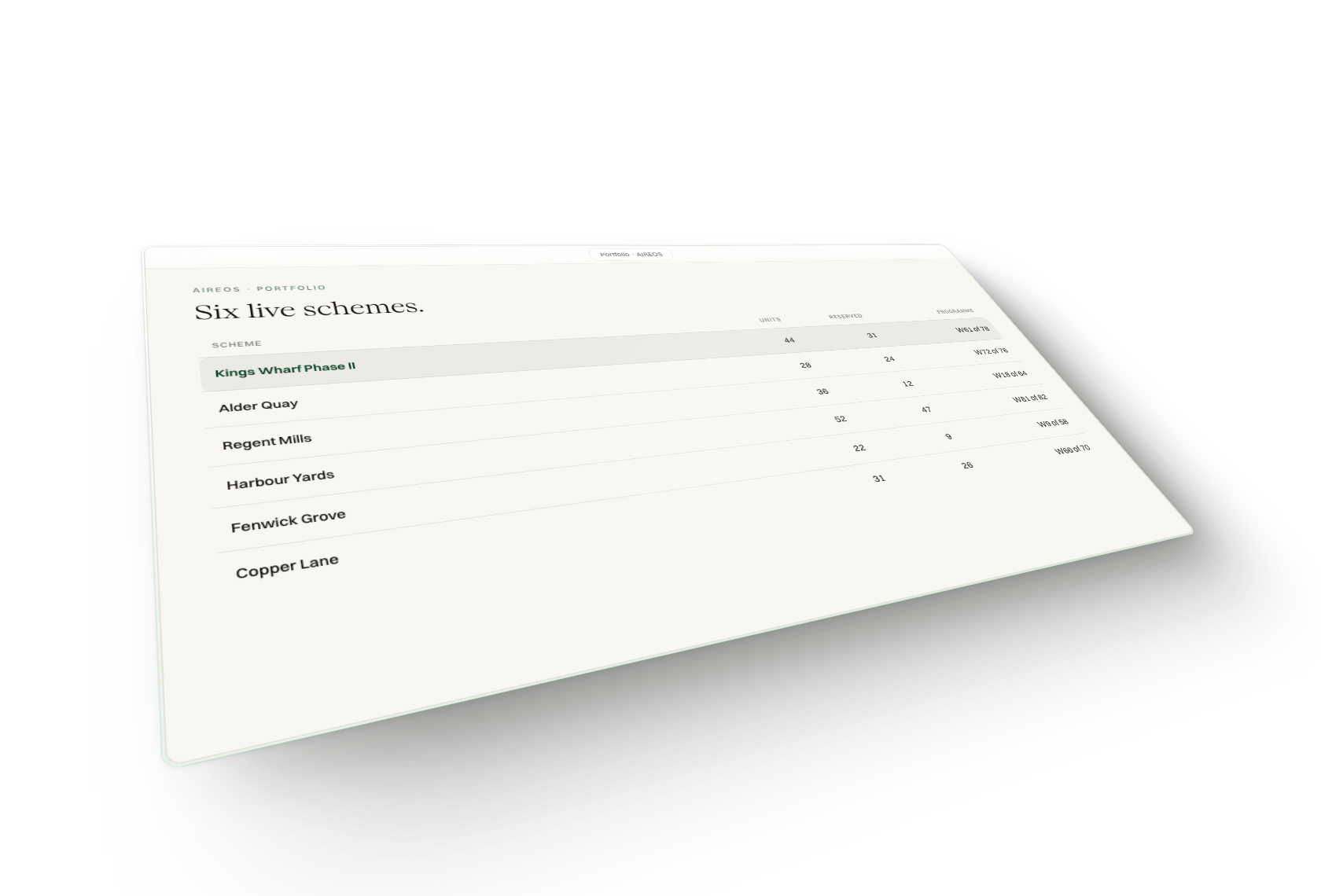
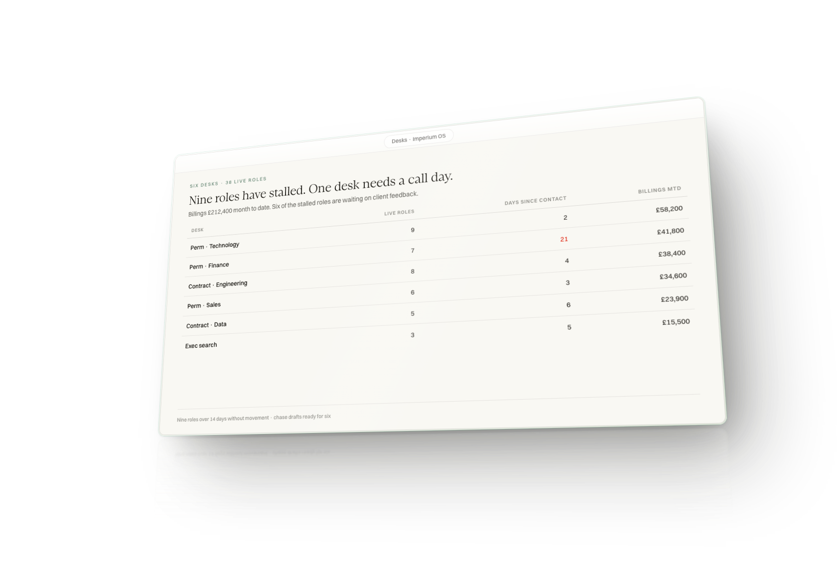
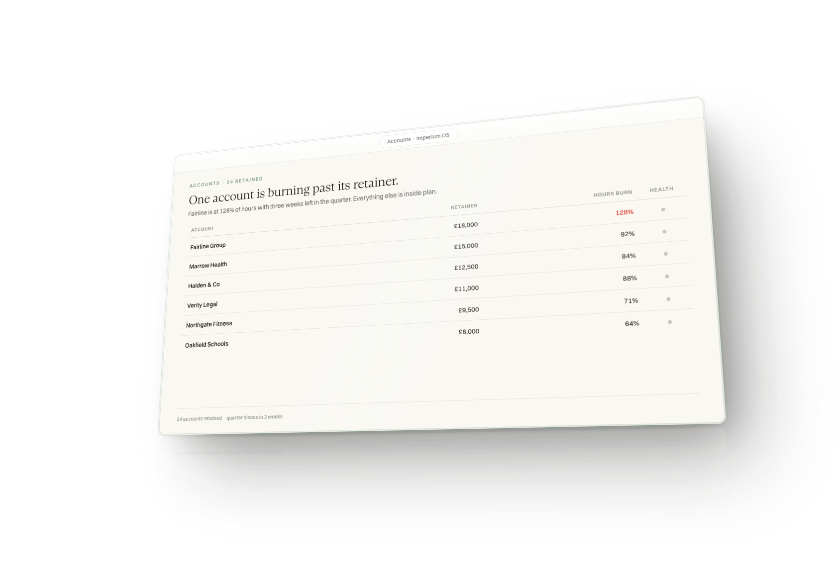
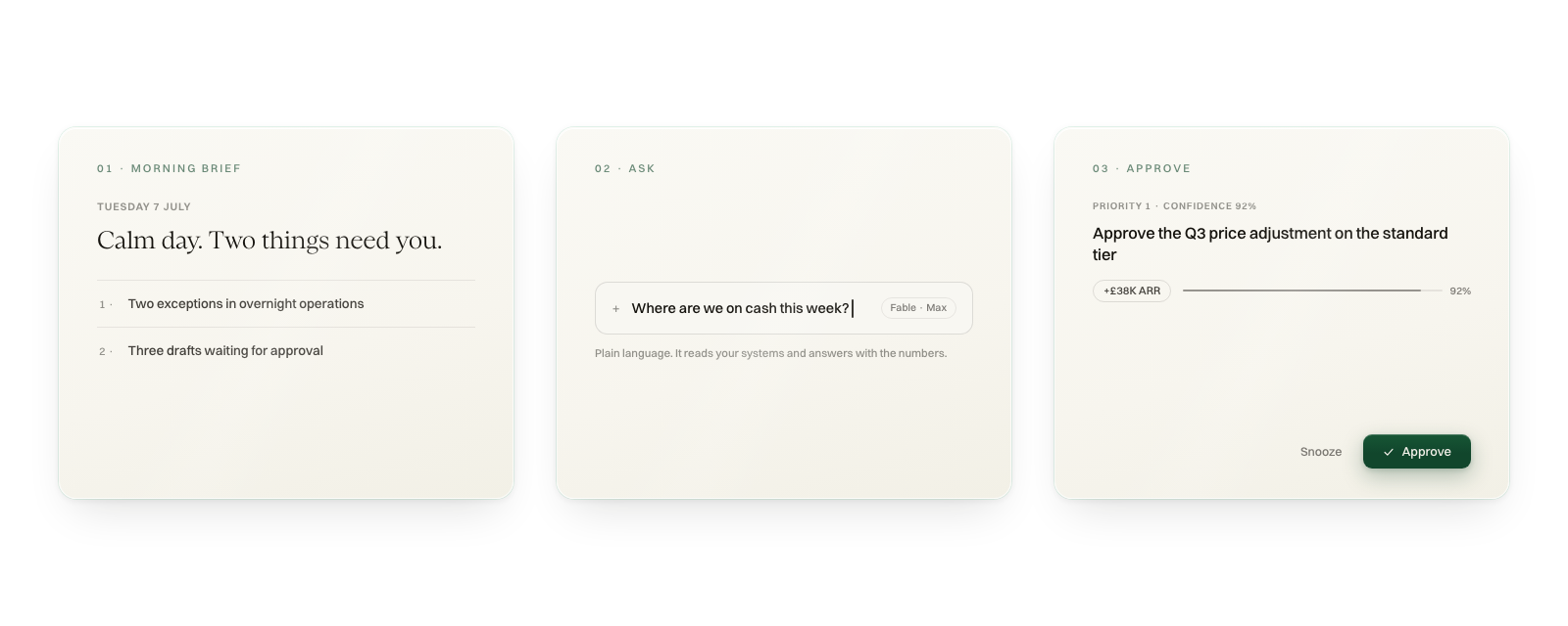
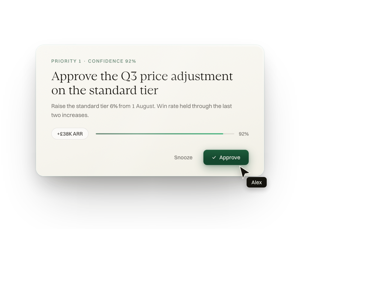
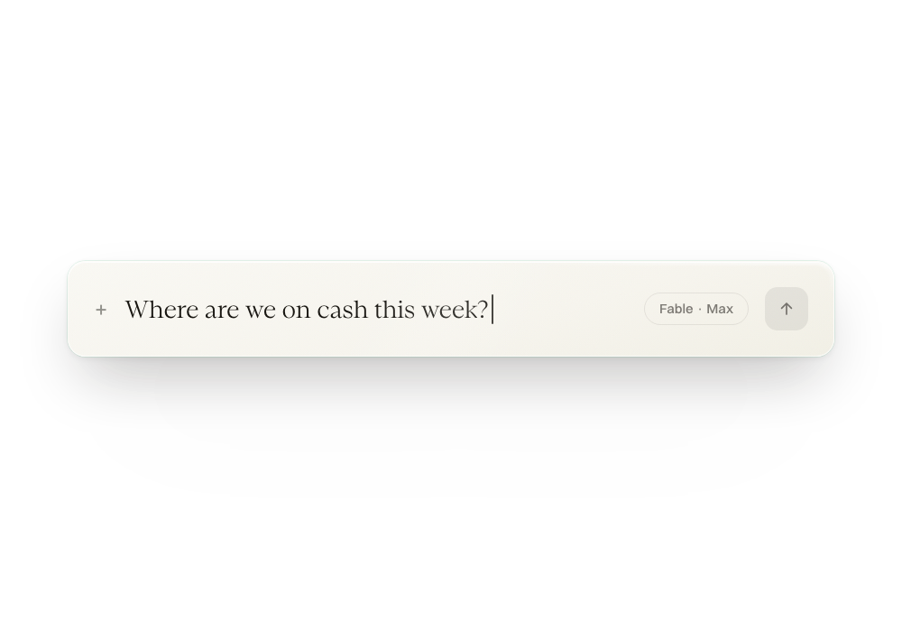
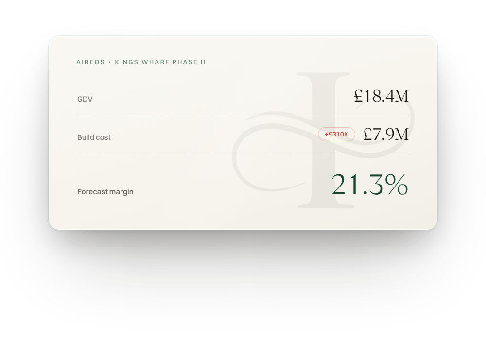
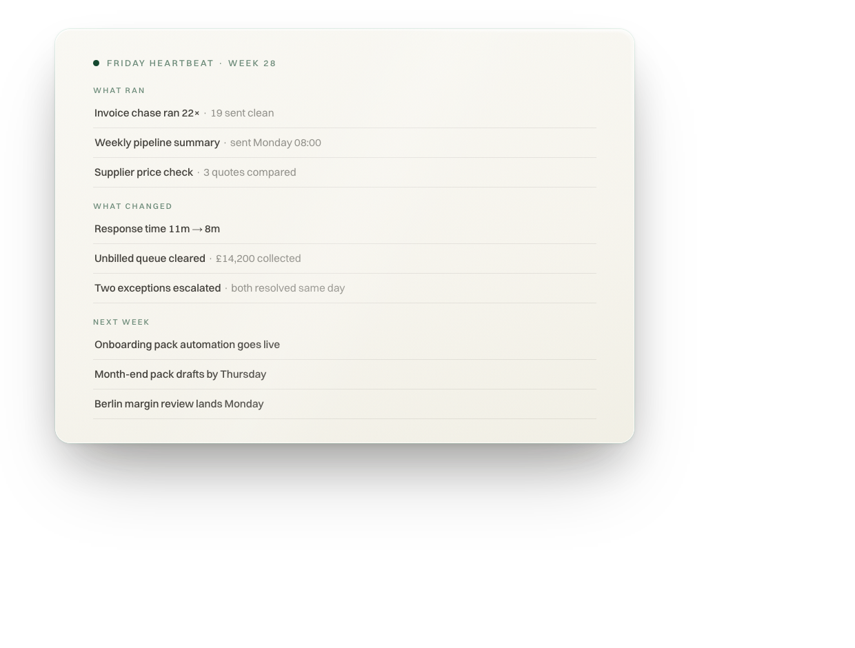
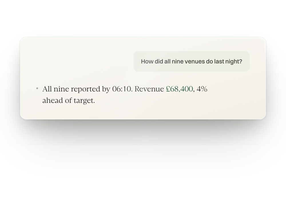
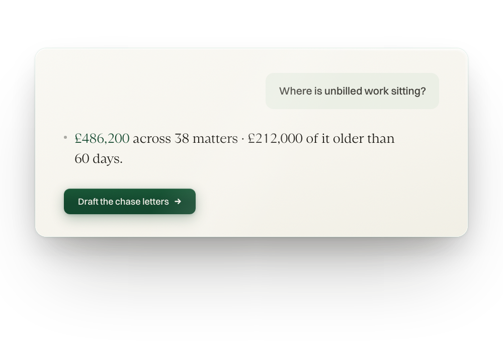
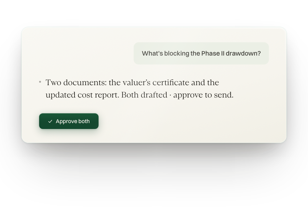
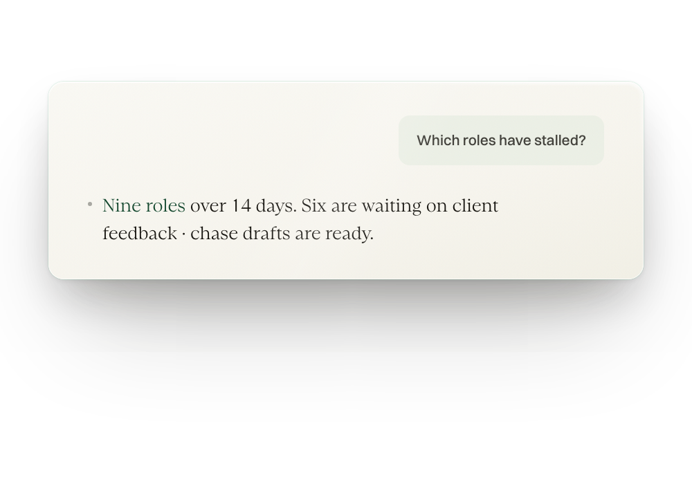
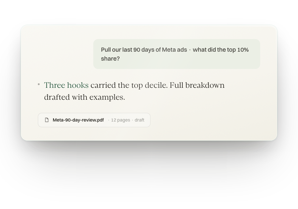
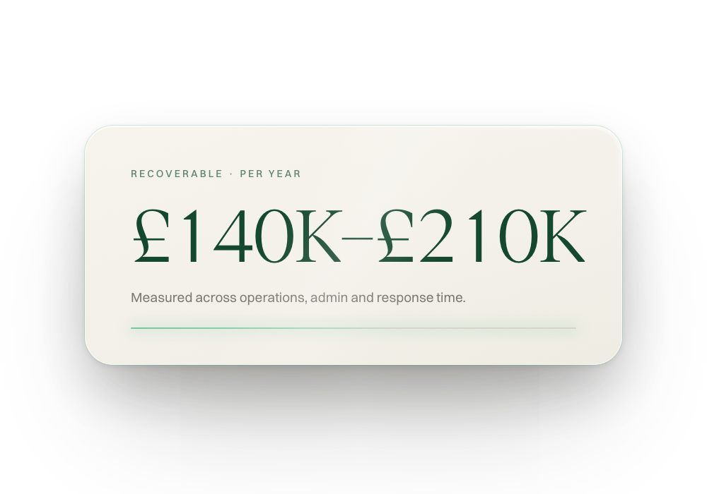
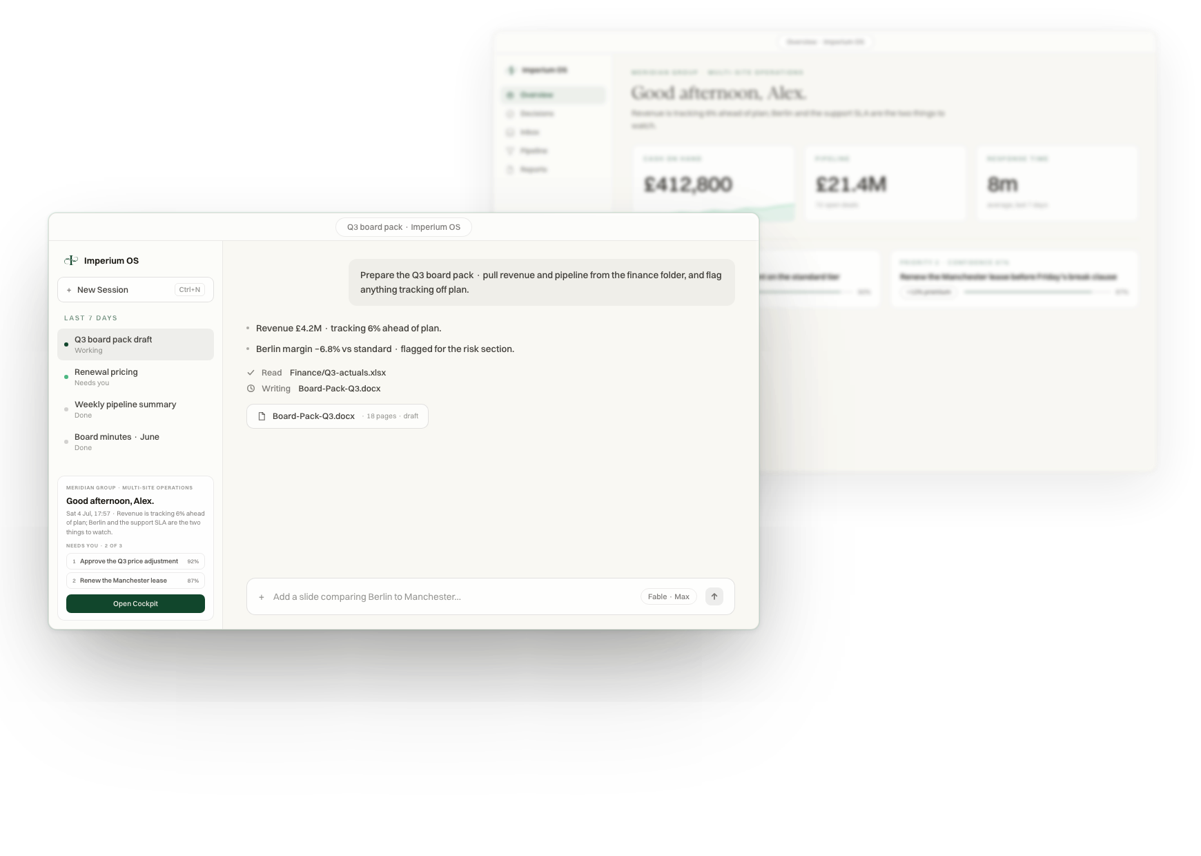
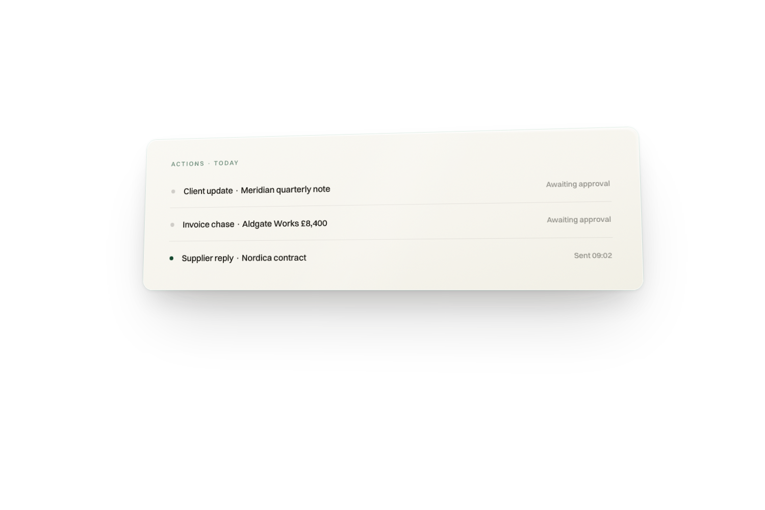
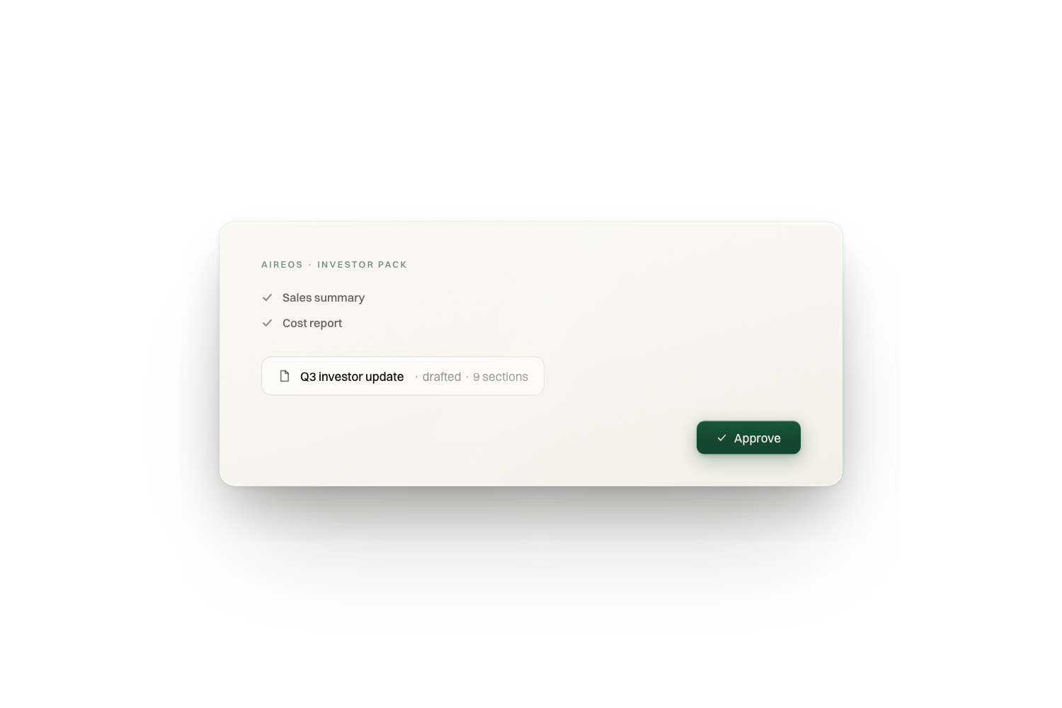
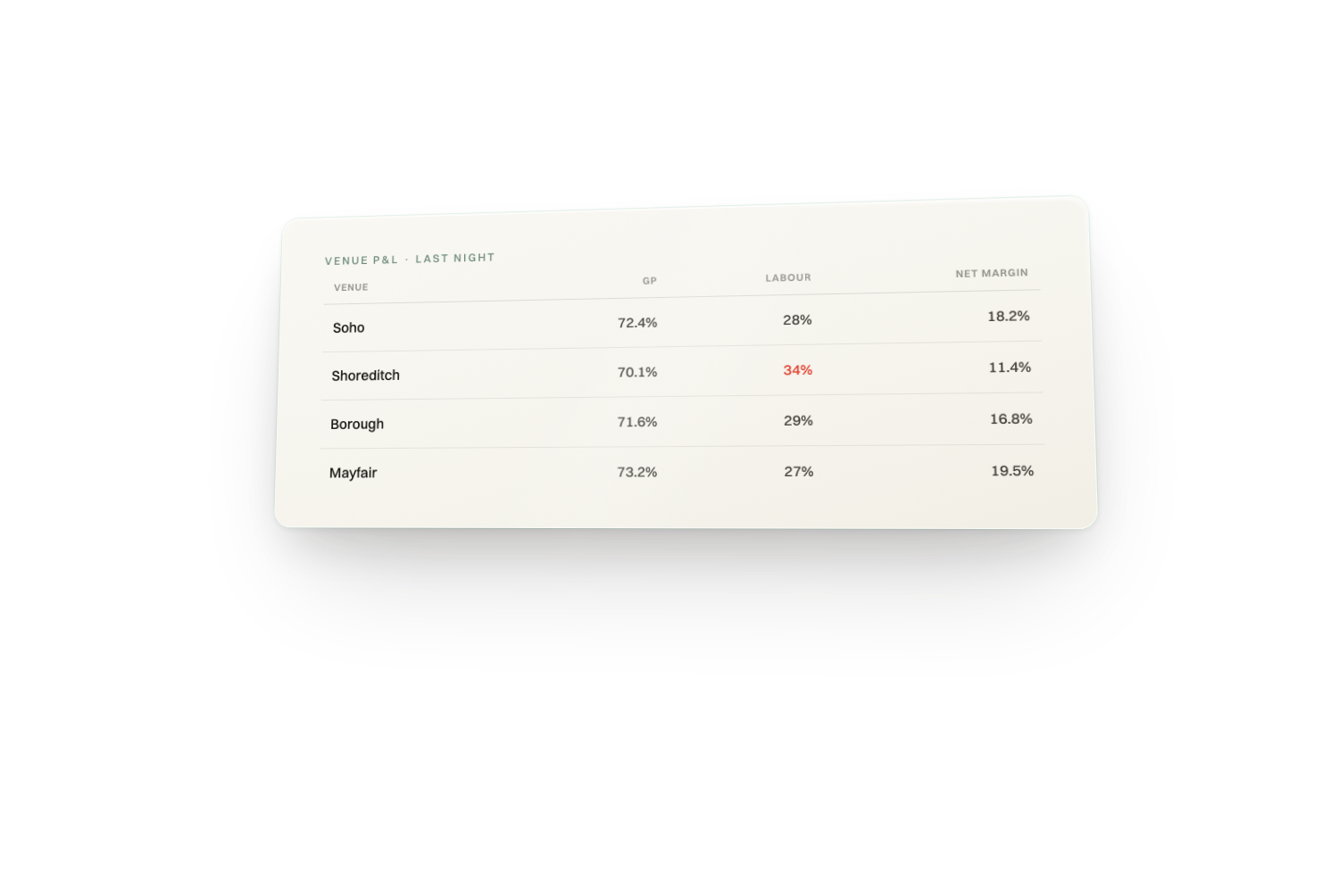
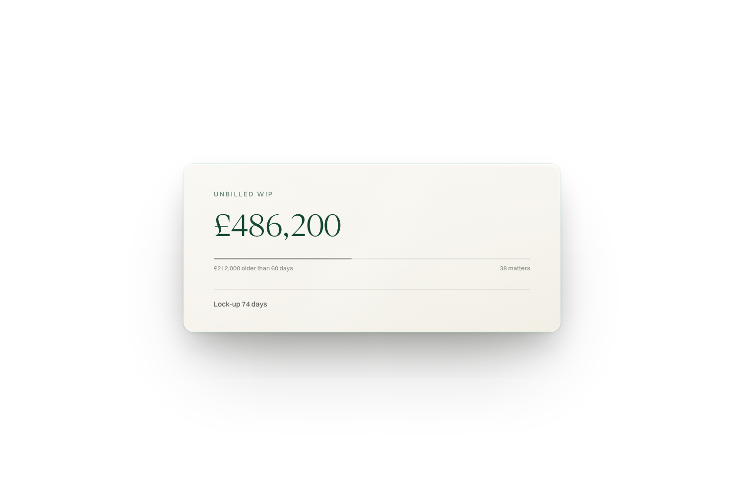
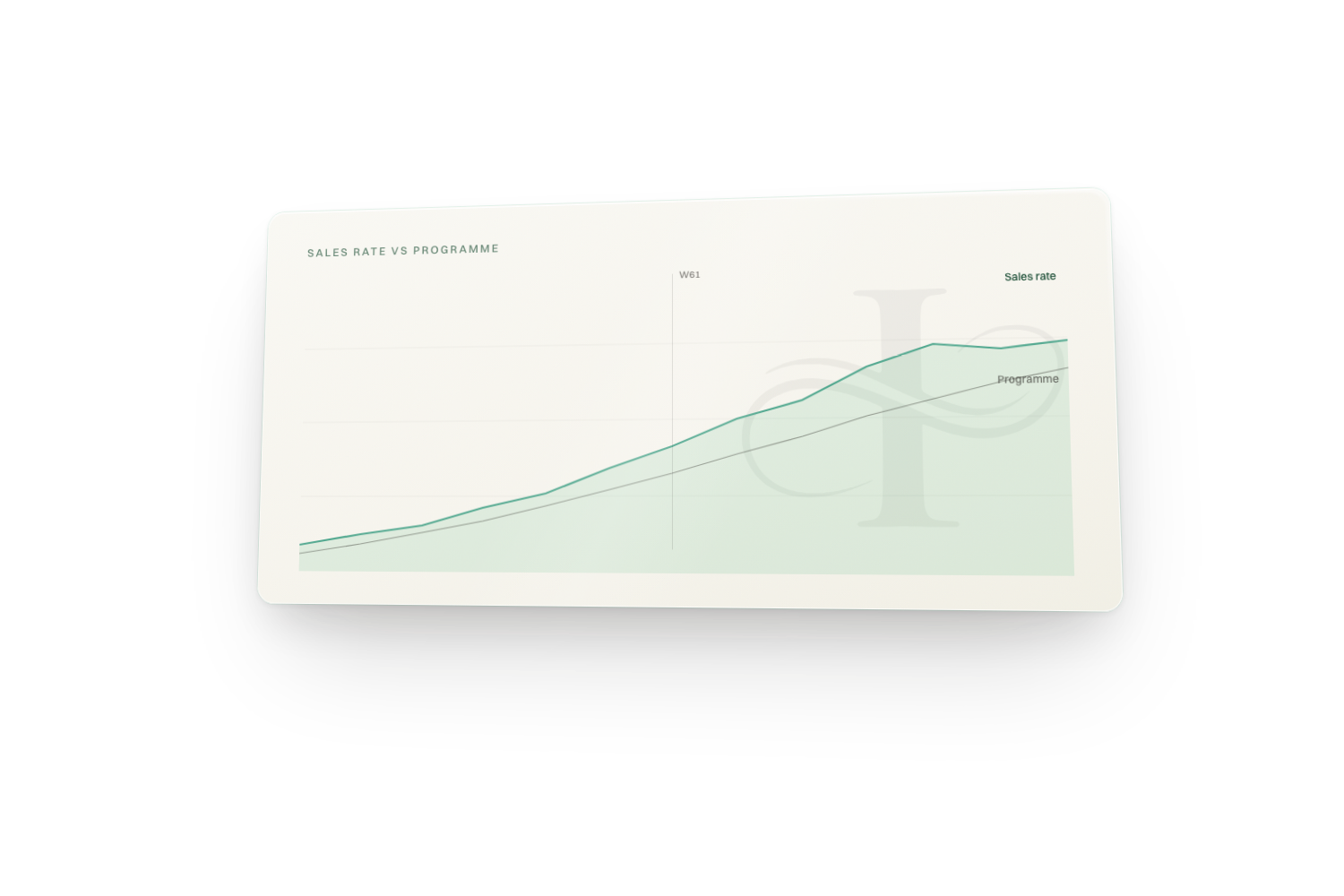
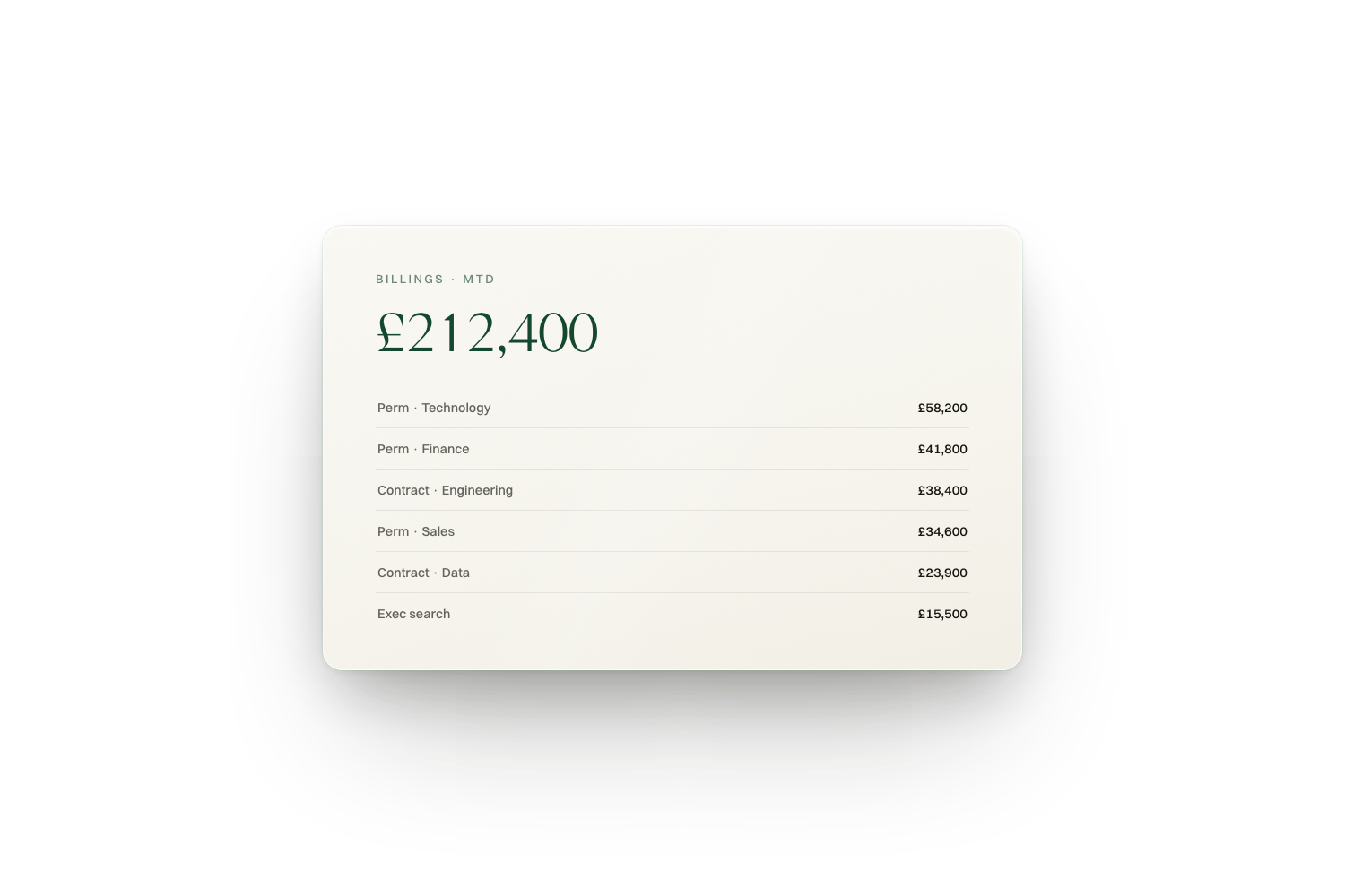
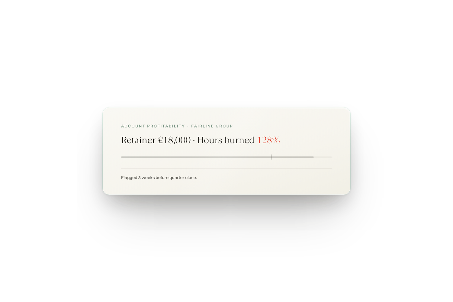
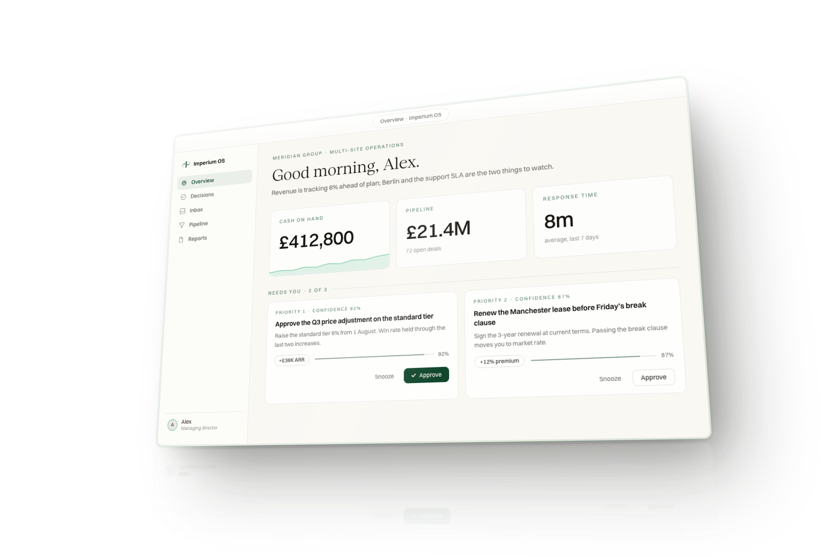
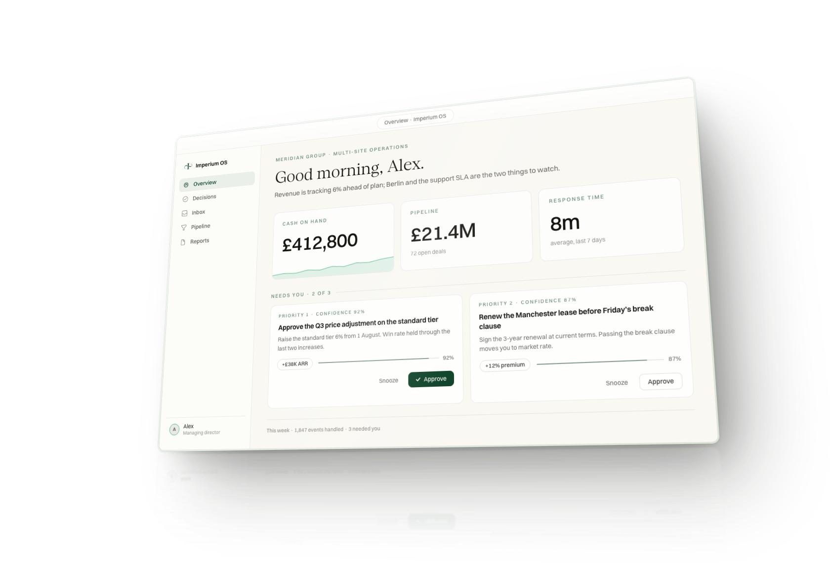
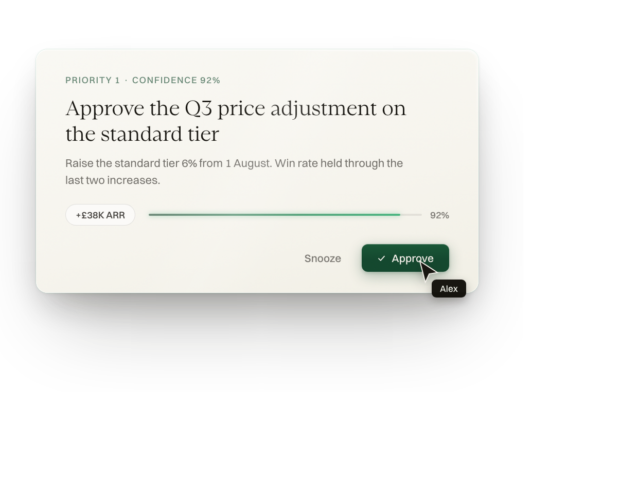
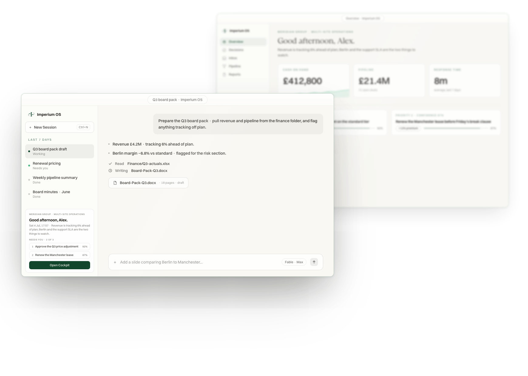
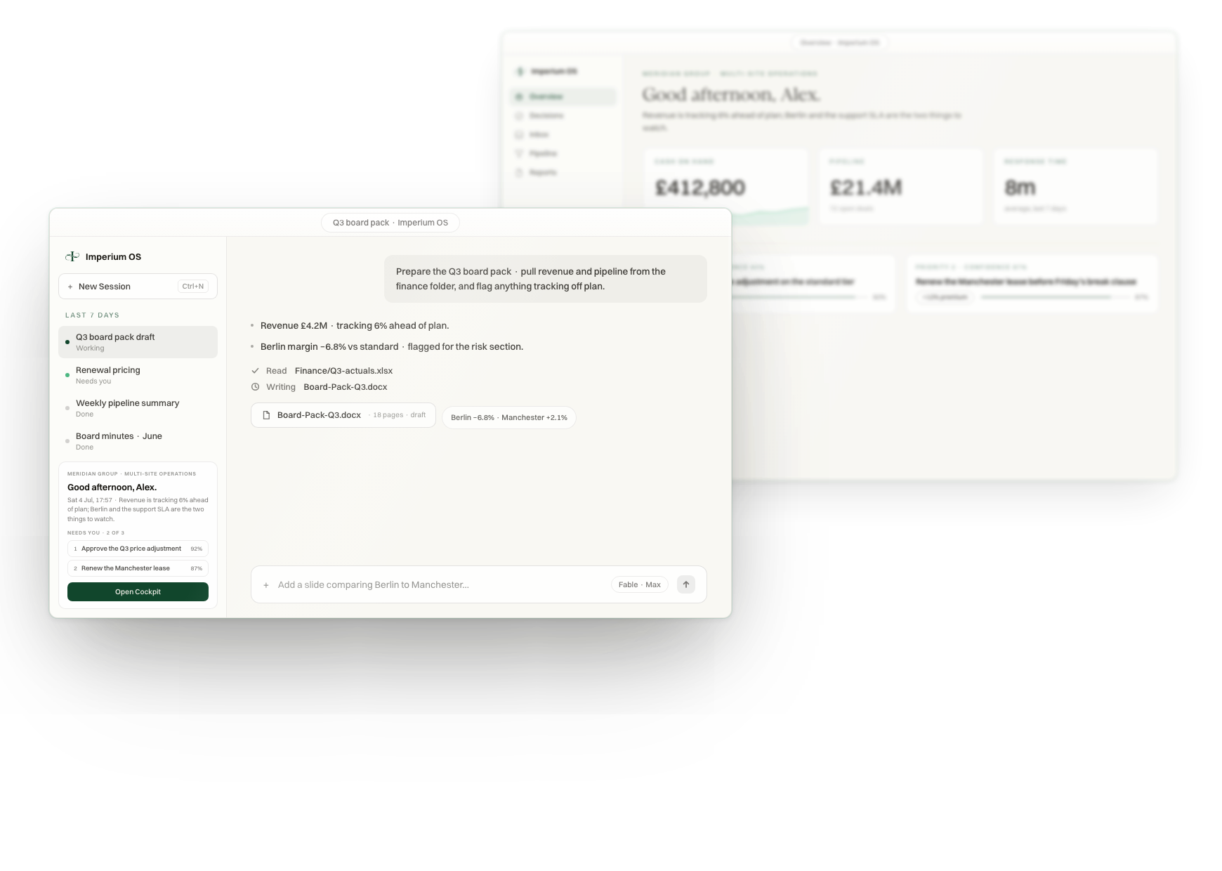
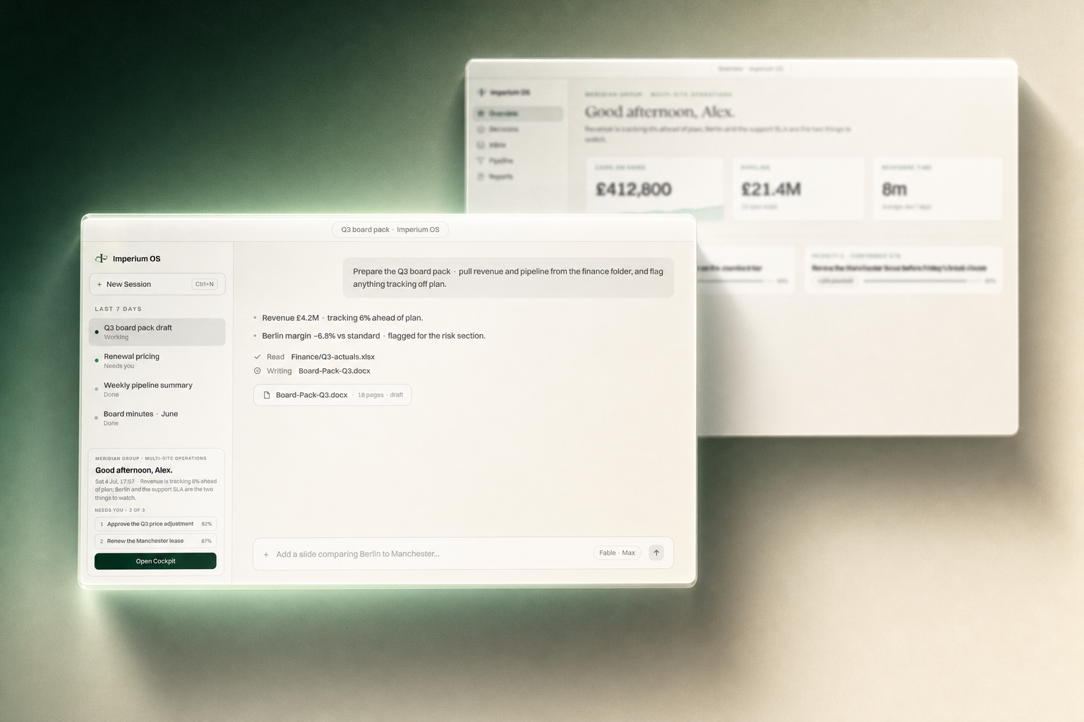
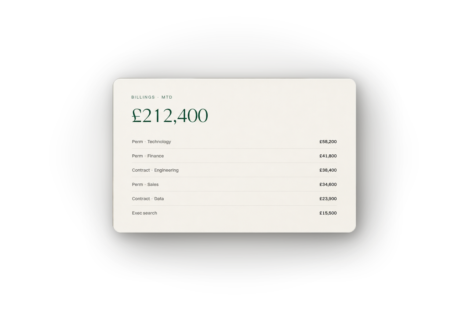
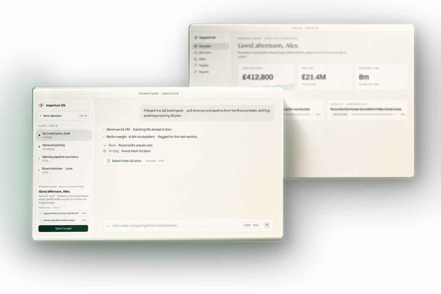
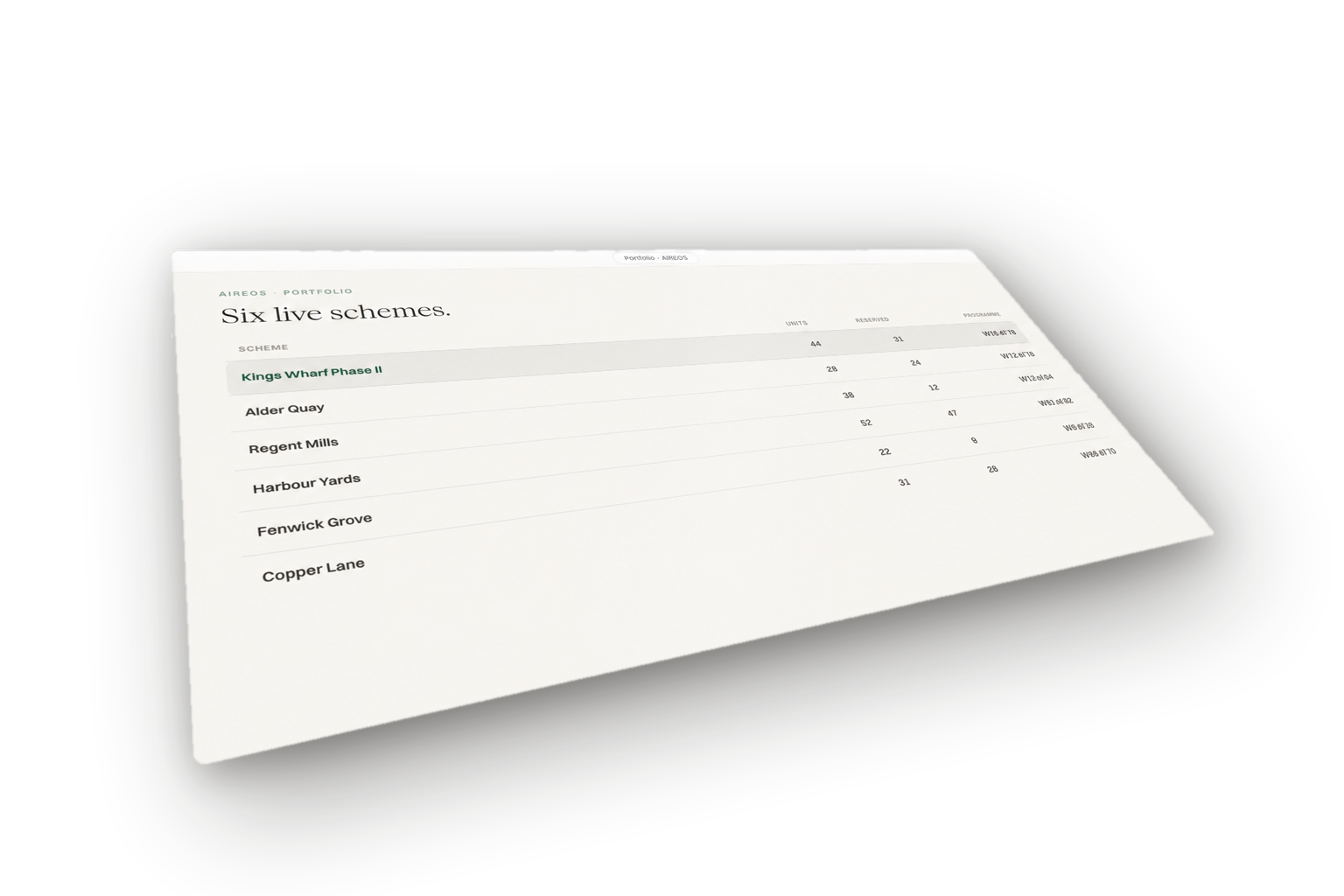
Marketing renders of the Imperium OS interface, built as CODE (never model-drawn UI): standalone HTML on the kit's tokens: Switzer UI text, Emilio Light display lines, greens only with at most one Ember alert, `#F9F8F3` panels, 2px radius on cards/panels (pointed re-lock 2026-08-22; the 12px app-window chrome exception is retired), codicon glyphs, the real monogram as the greyed watermark (mark-watermark.svg, never a generic serif I). The full set: the due-diligence card, the opportunities CRM tilt, and the 30-asset matrix (10 use cases x three framings: tilt hero / macro close-up / flat fragment), plus the 5 approved HOME alpha variants. Every render below except the due-diligence card is TRANSPARENT (page background stripped, shadows kept in the alpha channel, canvas auto-expanded so nothing clips) and sits directly on this page's ground; it will do the same on any site, deck or dashboard. Every card carries the premium finish layer (v4, 2026-07-30): gradient bone surfaces (never flat, never pure white), deep layered ink shadows with a mint ring, specular sweep + top-right corner glint + film grain in the surface, Emilio Light display lines with hero figures in Racing Green, mint-lit accent bars, and depth-of-field back windows in multi-window scenes, always as a transparent object (card + shadow only, no scene grounds, no floating annotation pills, no logo tiles). Source tree with every editable file: Alex OS/assets/imperium/mockups-v5/, mirrored in full under mockups/src/ in the kit (also mockups-src.zip); recipe: MOCKUPS.md. Premium finishing ladder per hero: GPT Image 2 edit-mode is the only UI-safe generative finisher (gpt-finish.mjs presets); Higgsfield (higgsfield / higgsfield-generate skills) may add glass, light and cinematic grade ON TOP of a finished hero; it garbles raw UI text, so never feed it the bare interface.
Due-diligence glass card: codicon status glyphs, one Ember alert, mint statuses, R40 (render predates the 2px pointed re-lock of 2026-08-22). Kept on its designed sage ground.
Opportunities CRM, CSS 3D tilt + depth-of-field. Transparent: window + soft shadow only, drops onto any ground.
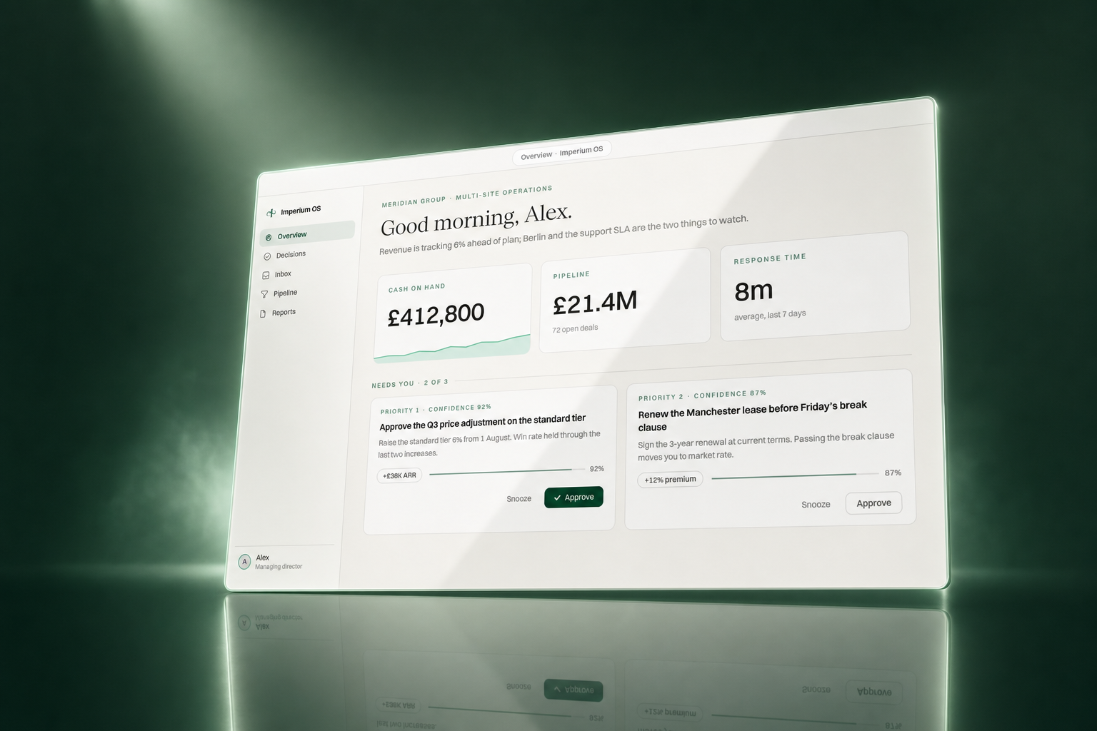
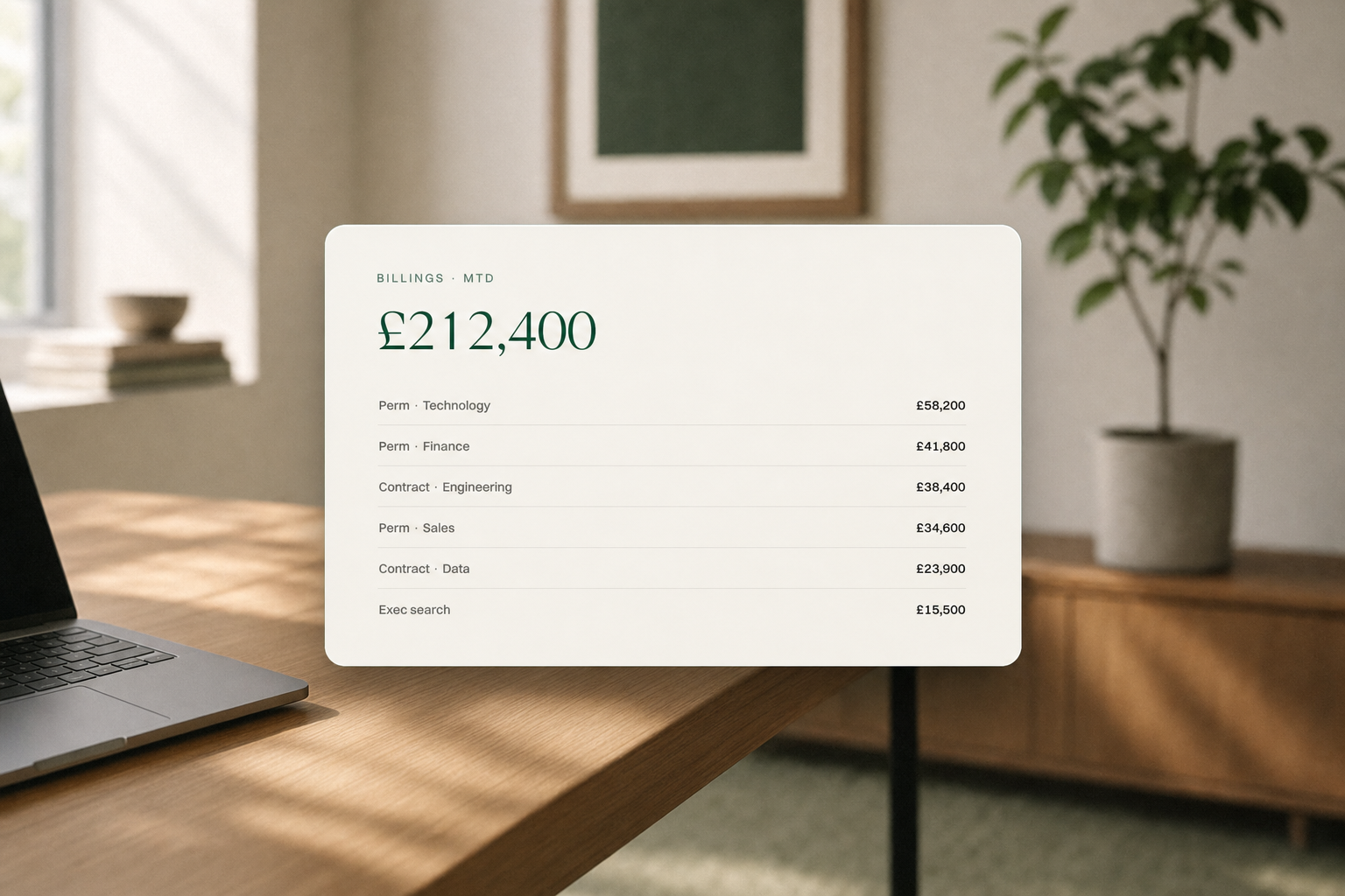
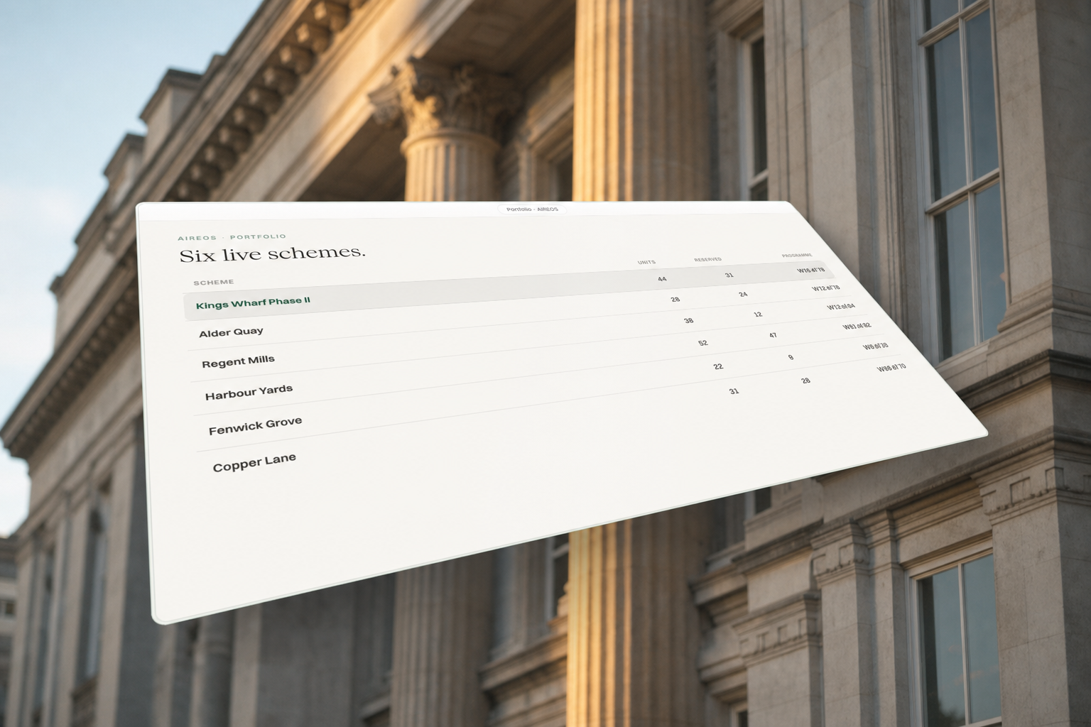
Four code renders taken through the premium finishing ladder, one treatment each, as worked examples of the pipeline: the transparent render is composited onto a brand ground, GPT Image 2 edit-mode (mockup-studio gpt-finish.mjs, custom brand prompt + layout guard) paints the environment and lighting while preserving the UI, then Higgsfield (higgsfield / higgsfield-generate skills, upscale tool) lifts the finished hero to 4K. Both skill docs ship in the kit: mockup-studio.md · higgsfield.md · higgsfield-generate.md. Environment doctrine (Alex, 2026-07-30): real-world editorial scenes or calm brand-solid grounds only; classical architecture, warm offices, studio light. NEVER sci-fi effects: no laser lines, no neon streaks, no abstract alien waves, no glowing particles. Rules that keep it safe: only GPT Image 2 edit-mode may touch raw UI; guard the prompt with an explicit layout lock (and protect intentionally blurred windows); expect the smallest labels to soften slightly; Higgsfield only ever touches the finished hero; transparent deliverables stay CSS-native (no generative pass can output alpha). Full recipe including the four exact prompts: MOCKUPS.md.
Cockpit tilt hero · racing-green studio: spotlight pool, glass screen, mirrored floor, haze, mint rim light. 4K in the kit (heroes/home-t-hero-4k.png).
Recruitment billings · warm office interior: oak desk, laptop, plant, framed green art, natural window light, shallow DoF behind the sharp card. 4K in the kit; transparent version below.
Property portfolio tilt · classical architecture: blurred stone facade with columns in warm morning light, sunlight grazing the centre column behind the panel. 4K in the kit (heroes/prop-t-hero-4k.png).
Cockpit family portrait · cinematic key light: deep forest-to-bone diagonal gradient, frosted slab thickness on both windows, long angled shadows, blurred back window preserved. 4K in the kit; transparent version below.
Recruitment billings · TRANSPARENT: the office-scene card cut back out, warm halo + natural shadow rebuilt in alpha. Drops onto any ground.
Cockpit family portrait · TRANSPARENT: both frosted-slab windows extracted with key-light bloom and angled shadows rebuilt in alpha.
Property portfolio · TRANSPARENT: the tilted panel extracted from the architecture scene via flood-mask (non-rectangular quad), shadow rebuilt in alpha.
Icon treatment styles (one source icon, three finishes)
The three sanctioned finishes for third-party app marks, shown on the same source icon (built with the app-icons pipeline in tools/app-icons). Raw = the untouched official mark for catalogs and docks. Glass = the glass-icon-studio treatment for console surfaces. Imperium porcelain = the branded ceramic recast for hero art and posts. Pick one finish per surface, never mix within a view.
raw · catalogs, docks, integrations UI
glass · console surfaces, feature UI
imperium porcelain · hero art, marketing posts
Colour grade (LUT pack)
The Imperium film look for footage and photography. bailey-mylook-2026-07.cube is the master colour grade for all Imperium and Alex footage: a 33-point 3D LUT exported from DaVinci Resolve by Bailey (videographer), received 2026-07-02. Apply it to LOG footage only; on already-graded Rec709 images it crushes shadows and shifts red. Underexposed log stills first get a measured exposure lift (target mean luma 90 warm scenes / 95 cool, EV clamped to 0.85), then the LUT, then a small saturation trim (0.94 warm / 1.06 cool). The full recipe with ffmpeg commands ships as luts/README.md; both files are in the kit zip under luts/.
Photo library (real photography of Alex & Archie, Google Drive)
Every real photo of the founders (talks, podcasts, workshops, BTS) lives in one public Google Drive: Imperium Photos — Bali Edition. Anyone with the link (human or AI, no auth) can browse, search within it, and download; nobody can edit. Each file is the final colour-graded version, one version per photo, organised per event. 00-primary-best-of-best is Alex's hand-picked hero set (also mirrored into event folders). Headless agents: fetch photos.json, the machine catalogue of all 262 photos: per-file direct view/download links, subject (alex / archie / duo), orientation, dimensions, 1-10 quality score, best-use hint, per-folder scene descriptions, and selection rules (best = 00-primary). For production sites, download the image and self-host; do not hotlink Drive URLs. Quality scores + source mapping also live in the repo at assets/imperium/alex-archie-photos/INDEX.md.
informal behind-the-scenes set (kept deliberately)
Icon library (one stroke, one language)
Sourced from Microsoft’s open-source VS Code icon library (codicons, CC BY 4.0), the engineered monoline set VS Code itself runs on. 16x16 grid, filled paths, single colour (mint on dark, Racing Green on light); every icon ships with fill="currentColor" so it inherits whatever text colour it sits in. Names map to codicons (plus→add, spark→sparkle, external-link→link-external, upload→cloud-upload; arrow-up-right is codicon arrow-up rotated 45°). Click any icon name to download; all 22 live in ./icons and in the kit zip.
8px base. The card "1u padding unit" (card anatomy) maps to space-5 (40px) at full card size and scales with the card. Containers: 1440px content max, 1720px full-bleed max. Grid: 12 columns, 24px gutter. Breakpoints: 640 / 1024 / 1440. Section rhythm: consecutive sections sit space-8 (80px) apart on desktop, space-6 (48px) under 1024px — consistent, no giant voids. Machine copy: tokens.json layout (mirror — do not edit here).
--space-1 · 8px
--space-2 · 16px
--space-3 · 24px · gutter
--space-4 · 32px
--space-5 · 40px · card 1u
--space-6 · 48px
--space-7 · 64px
--space-8 · 80px · sections
--space-10 · 128px
--space-12 · 192px
Type scale (size / leading / tracking per step)
Derived from the locked clamp scale in tokens.json (mirror — do not edit here). All numeric UI and documents set font-variant-numeric: tabular-nums.
Step
Face
Size
Leading
Tracking
Use
Display / H1
Emilio Light
clamp(3rem, 6vw, 5.5rem)
1.04
-0.01em
Page heroes, deck titles
H2
Emilio Light
clamp(2.25rem, 4vw, 4.25rem)
1.08
-0.01em
Section heads
H3
Emilio SemiBold
clamp(1.5rem, 2.4vw, 2rem)
1.1
0
Card titles, sub-sections
Body
Switzer Regular
clamp(1rem, 1.15vw, 1.125rem)
1.5
0.005em
Copy, UI text
Small
Switzer Regular
0.875rem
1.5
0.01em
Meta, captions, table cells
Eyebrow
Switzer Medium
0.8rem
1.3
0.22em · caps
Labels above headings
Wordmark
Emilio Light
context
1
0.14em · caps
IMPERIUM, always tracked caps
Logo governance (clear space, minimums, misuse, co-branding)
Clear space: the cap-height of the I on all sides — nothing enters it. Minimum sizes: mark 24px, horizontal lockup 120px digital / 12mm print. Co-branding: vertical hairline divider, equal optical height, partner mark on the right. Files come from logos/ verbatim — the six panels below are the only ways the logo gets misused, rendered so they are unmistakable.
cap-height of the I
Clear space = cap-height of the I, all four sides.
Never recolour. Brand tokens only — no hue shifts, no arbitrary tints.
Never stretch or squash. Scale proportionally only.
Never add effects. No drop shadows, glows, bevels, outlines.
Never regenerate by AI. The vector masters in logos/ are the only source.
Never place on busy grounds. Solid or calm brand surfaces only.
Never revive the retired set. Blue-teal #056050 iOS-squircle tiles are deleted; replace on sight.
UI primitives (buttons, inputs, table, tags, nav — pure tokens, both themes)
The pieces that dress a settings page. Everything below is built only from tokens (flip the page theme to see both modes). Two button families, never mixed: marketing CTAs are 2px pointed rectangles (Switzer Medium 14px, Racing solid or hairline quiet — the deck and site register), product buttons are 2px radius (Switzer 12.5px, green / line / ghost — the register of the shipped OS renders in the software-mockups section; new UI follows the book's 2px). Focus = 2px accent ring at 3px offset (:focus-visible, spec'd in BRAND-BOOK §3); disabled = 38% opacity. Inputs and selects use the 2px radius per the shape rule. Motion honours prefers-reduced-motion.
Full-width fixed bar: quiet Switzer links left (muted, never accent), Emilio wordmark dead-centre, log in + pill CTA right. Behaviour on the live site: transparent over the hero at top, Paper at 95% + blur after 24px of scroll, hides on scroll-down past 160px, returns on scroll-up; hairline hamburger on mobile. Never a floating pill nav.
Presentations — the continuous-world method (THE Imperium deck)
Every outward-facing Imperium presentation follows the continuous-world principles: every slide is a camera position inside ONE generated world (one place, one light grade, stills chained by reference); every forward slide change plays a short generated film frame-locked to both stills, so the audience sees a camera move, never a cut; text is always HTML on top (sharp, editable, choreographed), matched to negative space the composition reserved for it. The engine ships as a single self-contained file: deck-cinematic.html (availability probe with crossfade fallback, skip protection, ambient idle loop, click-thirds nav, ?slide=N deep links) with a working demo world in downloads/documents/world/ (Imperium's shipped AIOS keynote world). Generation method, prompts, SSIM seam gate, and the real cost model: continuous-world-technique.md + mission template. Middle tier when films aren't budgeted: static premium slides (generated backgrounds, no transition films) per imperium-presentation.md.
deck-cinematic.html · the continuous-world engine as one file: still → film → still with graceful crossfade degradation. Open it standalone and press → to feel the camera move between slides.
Text over photography is glass, never opaque: 8% bone fill, 24px blur, hairline border, R2, entrance stagger (0.35 / 0.5 / 0.95 / 1.2s + 0.18s per card).
Documents (invoice, letterhead, signature — and the utility deck)
The highest-frequency real surfaces, as fill-in templates on kit fonts + tokens: A4 print CSS, tabular numbers, horizontal lockup, one green accent, text stays text. Conventions (numbering, print shape rules, placeholder semantics): DOCUMENTS.md. Payment rails ship as placeholders by design — internal sessions fill from private rules, external users use their own. Deck routing: outward-facing → the continuous-world method above (default) · static premium → imperium-presentation.md · deck-template.html is the utility tier ONLY (internal working sessions, print handouts, zero AI spend — it is not the Imperium presentation look).
deck-template.html · utility tier: 16:9, six token-only layouts, both themes, print-to-PDF. For internal/working decks only — client and stage decks use the continuous-world engine above.
Voice — boilerplate and pillars (the productive half)
Approved company descriptions at three lengths, and the messaging pillars every asset draws from. SME language always; never "enterprise", "AI agency", or "Imperium Growth"; no em dashes; no age references. Full voice rules: BRAND-BOOK §9.
25 words
Imperium is an AI consultancy and AI software company. We build and run AI operating systems for SMEs, Palantir-style: serious decision systems, owned outcomes.
50 words
Imperium is an AI consultancy and AI software company, the Palantir for SMEs. We build and run AI operating systems for companies of £3-50M revenue: one system that connects their tools, runs their operations, and produces outcomes we own. AI runs systems, we run meaning.
100 words
Imperium is an AI consultancy and AI software company built for SMEs, the businesses the giants ignore. We design, build, and then RUN AI operating systems for companies of £3-50M revenue and 20-250 staff, Palantir-style: build it and operate it, own the outcome, never bill hours. One system connects the tools a business already runs, automates its operations, and puts real decision data in front of its operators. The brand carries one intersection everywhere: classical authority and modern technology. Real estate is the leading wedge, not the boundary. AI runs systems, we run meaning.
Pillars
AI runs systems, we run meaning — the thesis; we own outcomes, not hours. · The Palantir for SMEs — serious data-and-AI decision systems at a size the giants ignore. · Build it AND run it — productised done-for-you delivery, moving from consulting toward services-as-software. · Classical authority x modern technology — the brand soul; every asset carries a little of each.
Which skill builds what
You want
Skill
Notes
Marketing / category / article cards with 3D props
card-studio
Code chrome + Higgsfield porcelain props (locked style block), remove_background, composite. Working examples ship in downloads/cards/
Replicate a premium UI reference into an Imperium component
Imperium OS software mockups (marketing renders of the product)
mockup-studio + imperium-brand
Edit the mockups-v5 source tree (Alex OS/assets/imperium/mockups-v5/), apply the premium finish layer (MOCKUPS.md carries the exact recipe: gradient surface, deep ink shadows, glint + grain, Emilio display, mint accents, transparent object only), render via _scripts/render-alpha.sh. Optional per-hero polish: GPT Image 2 presets, then Higgsfield glass/light art passes on the finished hero only.
nano_banana_2 for props (nano_banana_pro on hard cases — AGENTS.md §3 routing table); never let a model draw card chrome or UI text.
Real third-party app icons + logo finishes
app-icons
Never let a model draw a third-party logo. tools/app-icons pipeline: extract installed macOS icons, fetch official marks from Wikimedia Commons (watch redirects for newer versions), or drop a client's SVG in, then raw / glass / porcelain finish per the Icon treatment styles section. Skill file in the zip under skills/.
Brand rules, voice, entity naming
imperium-brand
Loads this kit. Greens only, SMEs never enterprise, no "Imperium Growth".
Cinematic deck, generated motion between slides
continuous-world-deck
GPT Image 2 world stills + Seedance 2.0 start/end-frame films, HTML type. Kit + mission template in Downloads.
Static branded slides
imperium-presentation
AI atmosphere + code-composited text. Never model-drawn text/logos.
General UI / landing pages
frontend-design
Then apply these tokens on top.
Charts and dashboards
dataviz + gsap-* for motion
Swap the placeholder palette for the Colour section above.
Headless use (paste one link into any AI and it knows the brand)
Three machine entry points, all public, no auth: AGENTS.md is the agent operating guide (identity, visual contract, a capability-to-process map, and how to maximise the kit); llms.txt is the crawler index; manifest.json indexes all 299 canonical files with URLs and purposes. Give any AI session https://brand.imperiumos.ai/AGENTS.md and it can produce on-brand Imperium cards, consoles, icons, presentations, and pages without further briefing. Every process doc on this page is the current verified version, and BRAND-BOOK.md wins any contradiction.
One archive: brand book, tokens, all 13 font presets, the full 48-file vector logo set, every card HTML with its props and fonts, both console components, the glass folder, the colour-grade LUT pack, and all 15 skill/process files. Unzip it and any person or AI session can reproduce on-brand Imperium material with zero prior context.
Self-hosted woff2, one @font-face per weight (never synthetic bold). Emilio = display, Switzer = body/UI. Console surfaces use Switzer only.
Logos (48 files, vector masters)
Full set in the Logos section above: 4 marks · 3 wordmarks · 4 lockups · 4 tiles, each as SVG + transparent PNG (full + 256) + favicon ICOs. All in the zip under logos/.
Generated from one traced master path + Emilio Light outlines, brand tokens only (Racing Green #11462C, R2 tiles). The retired blue-teal squircle set is deleted; never reuse it.
card-studio process: code owns the chrome (gradient, noise, glints, type), nano_banana_2 renders the porcelain prop from one locked style block (nano_banana_pro on hard cases), remove_background cuts it, CSS composites it, a headless screenshot loop verifies. Props in the zip under cards/props.
imperium-ui-replicate process: pixel-loop a premium reference, element census, brand transfer to the tokens, calibrated motion (900ms odometer cash-rolls, sprung gauge). Dark + light themes via ?theme=light.
glass-icon-studio process: measure-first forensics on the reference, pure SVG glass (rim gradients, through-glass tint, slot shadow), max two render loops.
The canonical Imperium film look: 33-point 3D LUT from DaVinci Resolve. LOG input only, never delivered JPEGs; log stills get the measured exposure lift in the README before the LUT, then a small saturation trim.
components-lab lineage: premium references replicated pixel-first (mockup-studio tooling), then brand-transferred. Each file is self-contained (fonts beside it), page-transparent, dual-theme (?theme=light), with brand motion where the component is live. Drop straight into a site or dashboard.
Both tracks, current and verified: static hybrid slides (AI atmosphere + code text) and the continuous-world cinematic deck: one generated world via GPT Image 2 chained refs, Seedance 2.0 start/end-frame camera films between slides, HTML type on top, public Vercel deploy. Real cost model and QA gates included.
The full 30-asset matrix + heroes live in the repo at Alex OS/assets/imperium/mockups-v5/ (every folder self-contained: HTML + system.css + fonts + monogram). mockup-studio pipeline; GPT Image 2 then optional Higgsfield art pass per MOCKUPS.md.
The complete build recipes behind everything above. The portable prompt recreates the card method in any chat with no skill installed.
This page + BRAND-BOOK.md + imperium-tokens.css/tokens.json are the complete brand contract. Feed any one of the card files above to a fresh session as the style anchor and it can produce on-brand material first-shot. Version history: CHANGELOG.md. Requests and corrections: alex@imperium-growth.com.